These free typography books in PDF take you from the anatomy of a letter to the craft of designing your own typeface. You'll find practical guides, glossaries, type design manuals and classic histories of printing types, all ready to read online or download.
Some books here are references that designers keep open on their desks. Erik Spiekermann's Stop Stealing Sheep explains why some text reads effortlessly, and The Vignelli Canon sums up a lifetime of grid and type decisions.
Pick a section below and start with the book that matches where you are. New to type? Begin with the basics, then move on to type design and the history of the letters you use every day.
📚
Download every Typography book on this page
All the books on this page in one ZIP file, instead of downloading them one by one.
We will redirect you to accounts.google.com to complete sign-in.
Email and name only · We never send spam
Access unlocked
Download every Typography book on this page
All the books on this page in one ZIP file, instead of downloading them one by one.
Direct download · One ZIP file
Download started. Check your downloads folder for the ZIP.
Fundamentals
Typography Books
Start here if you want to choose, pair and set type with confidence. These guides cover letter anatomy, classification, hierarchy and the terms every designer uses.
Erik Spiekermann explains how type works in everyday life, from street signs to screens, and why some text reads effortlessly while other text tires the eye. This fourth edition, revised by the author, is packed with type specimens and photographs.
Massimo Vignelli sums up a lifetime of design in a few dozen pages: grids, typefaces, scale, white space and the discipline behind timeless work. A short, opinionated classic that graphic designers return to again and again.
A playful, illustrated guide to choosing the right typeface, getting the typographic details right and understanding how fonts are licensed. Written by FontShop as a dating guide between you and your next typeface.
Covers the ten main type classifications, from Humanist and Garalde to Didone, Blackletter and Script, with the history, key traits and typical uses of each. A quick visual reference for telling typefaces apart.
An A to Z of type terminology, from aperture and ascender to x-height, with every term shown in a real typeface. Keep it open when a brief mentions kerning, ligatures or small caps and you need the exact meaning.
A designer's personal reference of go-to typefaces, pairings and simple principles for digital and product design. Each typeface comes with examples of where it works best, so you can pick a font with confidence.
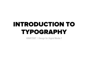
University course slides on what typography is, how it evolved from writing systems to digital type, and how it works in communication, interactive, information and motion design. A clear visual overview for first-year design students.
A community zine that explains type classifications, letter anatomy, page layout, accessibility and how to combine typefaces, with a worksheet and glossary at the end. Made by an activist design studio to share design skills freely.
A visual primer on the parts of a letter, the key identifiers that set typefaces apart and the main type classifications. Short exercises show how the choice of typeface changes the meaning of a word.
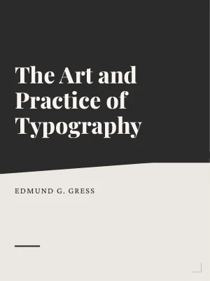
A richly illustrated 1917 manual of American printing that teaches layout, type selection, display composition and ornament through hundreds of real examples. It also traces the history of type up to the twentieth century.
A training manual on font categories, type measurement, spacing, alignment and the typographic rules that make documents look professional. The software examples are dated, but the fundamentals still apply.
A thesis that walks through the history and classification of typefaces before focusing on type for the web: font selection, readability, hierarchy and responsive text. Real interface projects show each principle at work.
A magazine on typography and graphic design with features on type in art, a guide to type styles, vintage beer mats and visits to famous print archives. Beautifully designed and full of inspiring lettering.
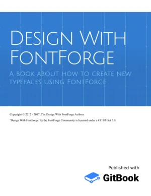
A complete guide to designing a typeface with free software, from planning and drawing the first letters to spacing, kerning, bold and italic weights and generating font files. Also covers Devanagari and Arabic glyphs.
The official handbook of Glyphs, one of the most widely used font editors among professional type designers. It covers drawing, components, spacing, kerning, OpenType features, variable fonts and exporting.
Rainer Erich Scheichelbauer, Georg Seifert and Florian Pircher
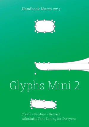
A beginner-friendly manual for Glyphs Mini, the simpler version of the Glyphs font editor. Learn to draw paths, build letters from components, set spacing and kerning and release your first font.
Stella Chupik, Rainer Erich Scheichelbauer and Georg Seifert
One of America's great type designers explains how each letter of the alphabet took its shape, with fifteen interpretive alphabets he drew himself. An essential read on the craft behind letterforms.
Goudy shows how to construct well-proportioned letters, starting from Roman inscriptions and moving to lowercase, italics and spacing. A hands-on companion for anyone learning to design letterforms by hand.
A doctoral study of how professional designers actually create text typefaces, based on interviews and the author's own design work. Maps every stage of the process, from first sketches to a finished family.
A dissertation from the MA in Typeface Design at the University of Reading on the design of math types, through three case studies: Times 4-line Mathematics, AMS Euler and Cambria Math.
Every typeface you use has a past. These classics trace printing types from Gutenberg to the type foundries of England and America, with facsimiles of the original letters.
The classic history of printing types, from the scribes and the first printers of Germany and Italy to the type founders of France and the Low Countries. Hundreds of facsimiles show the original letters.
The second volume of Updike's history follows printing types in Spain, Holland, England and America, ending with advice on choosing type for modern work. Illustrated with facsimiles from each period.
A detailed account of how printing began, from early prints, block books and playing cards to the work of Gutenberg and his associates. Includes facsimiles of the earliest types and woodcuts.
A master printer explains how type was cut and cast, how the point system came about and how roman, italic and other plain types were named and sized. A window into the craft of the 1900s type foundry.
The story of England's type foundries from the first printers to Caslon and beyond, with specimens of the types they cast. Still the standard reference on the origins of English type.
The first manual of printing in English, written in 1683, describing how letters were cut, cast and set by hand. This edition was reprinted by the Typothetae of New York with notes by Theodore De Vinne.
The second volume of Moxon's manual covers the compositor's and pressman's work: setting lines, imposing pages and running the press. A first-hand record of the printing shop in the seventeenth century.
Send this page to someone who’d love to read it. Everything is free, no sign-up needed.
Esc
Start typing to search...
Searching...
We couldn't find anything
Your book is downloading!
If InfoBooks helped you, you can support us in one click: add us as a preferred source on Google. You'll see more of our books when you search, and you'll help us keep sharing free reading with everyone.
Done! Your book is downloading
Know someone who’d enjoy reading it? Send them this page. It’s free, no sign-up needed, and you help us spread the love of reading.